
Properly Appointed: Red, White & Blue

There are certain color combinations that never require an explanation. Red, white, and blue is one of them. It carries meaning before you even begin to design around it, patriotic, yes, but also timeless in a way that transcends the holiday. Walk through the great rooms of historic homes, the libraries of well-appointed estates, the navy-blue kitchens that have appeared in shelter magazines for the
better part of a century, and you will find this palette quietly at work. It has staying power because it is built on something true: these three colors simply belong together.
This Fourth of July, we are sharing our favorite paint colors in each, the whites we keep returning to, the blues we have never once regretted, and the reds that ask a little more of you. Consider this your permission to be a bit more deliberate with color this summer.

On White
White is deceptively simple. Most clients come in assuming white is the easy choice, the safe one, a way to avoid commitment. And then they discover that white is perhaps the most nuanced decision in the room. It reads differently depending on your light, your floors, the undertones of your trim, the time of day. A warm white in a north-facing room can feel grey by afternoon. A cool white in a sun-drenched kitchen can feel almost clinical.
The goal is not to find the perfect white in the abstract. It is to find the right white for your specific room.
A few we come back to again and again: Simply White by Benjamin Moore, which sits beautifully in almost any light without reading stark. Chantilly Lace for those who want something truly crisp and clean. And Westhighland White by Sherwin-Williams, featured above in our Belle Meade Cottage project, a warm, creamy white that feels inviting, timeless, and beautifully layered throughout a home.
On Blue
Blue is the great consensus. Of all the colors we work with, it is the one that consistently earns agreement, from clients who came in certain they wanted something neutral, from husbands who thought they had no opinion, from guests who walk into a finished room and simply exhale. Blue has a way of doing that.
We love it in a study as a deep navy, moody and grounding. We love it on a porch ceiling as a soft sky tone, a Southern tradition with good reason. We love it in a kitchen or a bedroom where it reads as ease. There is a reason our inbox fills up with blue inspiration images more than any other color. People know what they love, even before they say it out loud.
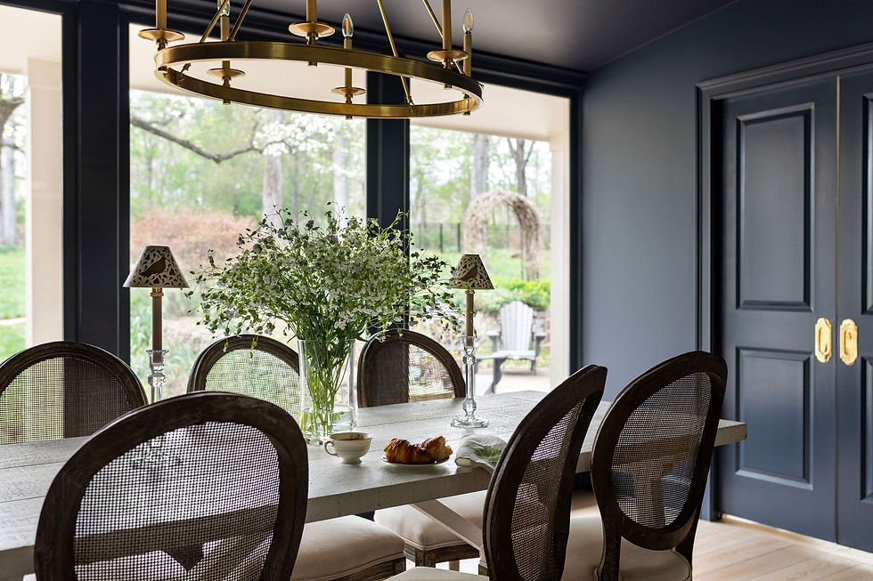
Our current favorites: The dining room pictured above is painted Hale Navy by Benjamin Moore, one of our most trusted navy paints for its timeless depth and versatility. Van Cortland Blue by Benjamin Moore offers a softer, more muted blue with historic charm, making it a beautiful choice for spaces that call for quiet sophistication. And Pale Blue No. 22 by Farrow & Ball is an airy, understated blue that brings a fresh, tranquil feeling to bedrooms, baths, and other light-filled spaces.
If you are on the fence about committing to blue, our advice is always the same: do it. You will not regret it.

On Red
Red is a different conversation entirely.
Of all the colors in our palette, red is the one that divides the room most definitively. Clients either light up when we suggest it or take a step back. There is very little ambivalence. And we think that is actually one of its great qualities. Red knows what it is. It does not try to please everyone. It is confident in a way that asks you to be confident too.
We especially love red in spaces where you can embrace a little drama. A powder bath, dining room, library, or front door are all perfect opportunities to make a memorable statement. These are the rooms that invite personality, and red delivers it beautifully.
Our current favorites: The powder room above from our Southern Classic project features Bewitched by Benjamin Moore on the trim. The rich, saturated hue creates a striking backdrop while allowing the wallpaper and brass accents to shine. Caliente by Benjamin Moore is one of our favorite true reds, offering warmth and timeless appeal. Radicchio by Farrow & Ball brings an earthy sophistication that feels layered, inviting, and full of character.
If you have been sitting with the idea of red and talking yourself out of it, consider this your nudge. Not every room, not every client, but for the right space, in the right hands, red is extraordinary.
The Color Story That Lasts
What makes red, white, and blue endure beyond the holiday is that each color brings something distinct: white creates space and clarity, blue anchors and calms, and red makes a statement. Together, they create a palette that is balanced without being boring. Layered without effort.
You do not have to wait for the Fourth to use them. These are colors for living rooms and dining rooms, for front doors and back porches, for kitchens that will be cooked in for decades. They are, in every sense of the phrase, properly appointed.
If you are considering a new color direction and would love a second opinion, we would love to help.
— Jessica
If you're looking for full-service interior design for your new construction or renovation project, please reach out to us at jessica@dogwoodproper.com.


Comments